
Your author website does not have to win a design award to do its job well. It does need to help a reader take the next sensible step.
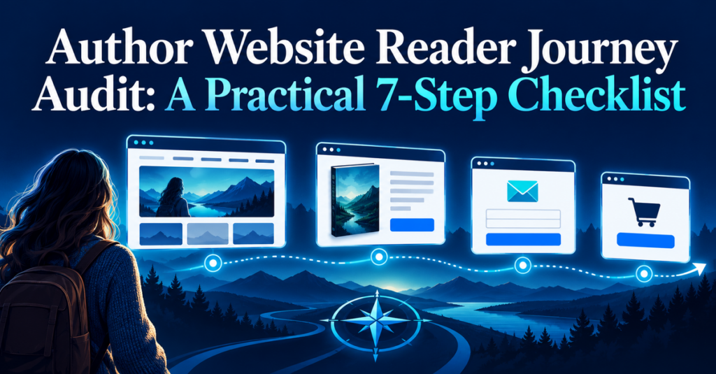
An author website reader journey is simply the route someone takes after they arrive: perhaps from a social post, a recommendation, a search result, or the back matter of one of your books. Can they quickly understand what you write, find the relevant title, decide where to buy or borrow it, and join your list if they would like to hear from you again?
This audit is for the busy author who has a website already but is no longer sure whether it still works as intended. Set aside 45 minutes, use a private browser window or a device where you are not logged in, and follow the route as a new reader would. You are looking for friction, not perfection.
Table of Contents
- Start with one reader and one goal
- Check the first ten seconds on your homepage
- Follow the route to one book
- Test every buying and borrowing link
- Make the email signup worth taking
- Check the journey on a phone
- Record the repair and repeat the test
Why an Author Website Reader Journey Matters
An author website is one place where you can connect your books, reader list, archive, and recommendations without relying on a single retailer or social platform. ALLi’s author-platform guidance makes the same practical point: visitors need to be able to navigate confidently through your web presence, not become trapped in a loop that gives them no useful next step. ALLi’s author platform guide is a helpful reminder that the site serves both a reader’s needs and your own engagement goals.
This is also a maintenance issue. WordPress recently advised site owners to check their PHP version and hosting updates after a critical PHP security release; WordPress points users to Tools → Site Health → Info → Server to see the active PHP version. WordPress’s October 21 security notice does not mean every author has a problem. It does mean that a reliable reader path depends on systems you occasionally check.
The audit below uses two examples. Maya writes a contemporary mystery series and wants a new visitor to discover The Last Harbor, then join her series-news email list. Daniel writes practical leadership books and wants a visitor to identify the right book for their current management problem, then download a useful worksheet. The pages differ, but the audit is the same: make the next step clear, test it, and record what needs attention.
1. Start With One Reader and One Goal
Do not test the whole site at once. Choose one likely visitor and one outcome you want to make easy. A focused author website reader journey is much easier to inspect than a vague wish to “improve the website.”
For Maya, the reader is someone who has seen a recommendation for her latest mystery. The immediate goal is to reach that book’s page. The secondary goal is to join the series list.
For Daniel, the reader has searched for help with a difficult team conversation. The immediate goal is to find the leadership book that solves that problem. The secondary goal is to download a worksheet and receive future practical guidance.
Write one sentence before you open your browser:
A reader who arrives from [source] should be able to [main action] within [reasonable time], then see [useful next action].
Maya’s version is: “A reader who arrives from a recommendation should be able to find The Last Harbor within 30 seconds, then see how to join the series list.” Daniel’s is: “A manager who arrives from search should be able to identify the relevant book within 60 seconds, then download the companion worksheet.”
This sentence prevents attractive but low-priority changes from taking over the session. A new color palette can wait if the reader cannot find the book.
2. Check the First Ten Seconds on Your Homepage
Open your site in a private window. Do not start by reading as the person who wrote every word. Start by asking what a stranger can tell from the visible screen.
Can they answer these questions without scrolling too far?
- Who is this author?
- What kind of books or help do they offer?
- Where can I find the most relevant book?
- What should I do next?
Maya’s previous homepage opened with a large image and the phrase “Stories from the edge.” It looked atmospheric, but it did not say that she wrote coastal mysteries or point to the newest book. Her repair is a short, specific opening: “Coastal mysteries where buried secrets reach the shore.” She adds two visible links: Start with The Last Harbor and Get series news.
Daniel’s homepage used a general biography before the books. He changes the order so the first screen says, “Practical leadership books for managers handling difficult conversations,” followed by Find the right book and Download the conversation worksheet.
Google’s guidance on links supports this simple test. It says that clear anchor text helps people and Google understand where an internal link leads. Google’s SEO link best practices are not an instruction to stuff keywords into every button. They are a reason to replace unclear labels such as “Click here” or “Learn more” when a precise label would help a reader decide.
Quick homepage test
Ask a trusted reader to look at the homepage for ten seconds and answer: “What does this author write, and where would you click first?” If their answer does not match your intention, note the gap before changing anything.
3. Follow the Route to One Book
Choose the exact book a new reader is most likely to need. Click to it from the homepage, then inspect the book page as a small decision page rather than a storage place for every detail you know.
The page should make four things easy to find:
- The title, format, and series position where relevant.
- A short description that makes the reader’s fit clear.
- A prominent path to buy, borrow, or learn more.
- A useful next step if they are not ready to purchase today.
Maya notices that The Last Harbor is listed only in a small carousel below several older titles. She creates a direct homepage link and moves the latest book to the top of the series page. Her book page names it “Book 3 in the Harbor Watch Mysteries,” includes a concise description, and offers Choose your retailer plus Start with Book 1 for new series readers.
Daniel realizes that his three books have similar covers and titles, but no page explains which problem each solves. He adds a short “Choose this book if…” line under each title and a comparison paragraph: “Start with Clear Conversations if you need a process for one difficult discussion; choose Team Agreements if you are setting habits across a group.”
This is not a claim that one page will guarantee a sale. It is a way to reduce the number of unanswered questions between interest and action. A reader can leave without buying and still have found the right title, remembered it, or joined your list.
4. Test Every Buying and Borrowing Link
This is the least glamorous step and often the most valuable. From the book page, open each retailer, library, audiobook, sample, or newsletter link in a new tab. Check that it reaches the intended live destination, shows the right format, and does not produce an error, redirect loop, unavailable title, or expired promotion.
Use this small record:
| Link | Expected destination | Result | Next action |
|---|---|---|---|
| Ebook retailer | Current ebook product page | Works / fails | [date and owner] |
| Print retailer | Current print product page | Works / fails | [date and owner] |
| Library or audiobook | Correct title and format | Works / fails | [date and owner] |
| Email signup | Confirmation and welcome email | Works / fails | [date and owner] |
Maya finds that her audiobook link opens a regional page where the title is unavailable. She changes the label to Find the audiobook in your region and points to the page that lets the listener select a service. Daniel finds that a retailer link still carries the tracking code from an old campaign. He replaces it with the current clean product URL and records the change.
If you use WordPress, take two minutes to look at Tools → Site Health after your reader-path test. WordPress describes that screen as a place to review critical configuration information and items needing attention. Its Site Health documentation gives the basic route. Do not make unfamiliar server changes yourself; ask your host or qualified support when the repair is outside your knowledge.
5. Make the Email Signup Worth Taking
“Join my newsletter” is not always enough of a reason for a first-time visitor. Say what the reader will receive, how often, and why it connects to the book experience.
Maya’s generic form becomes: “Get a new Harbor Watch clue, occasional behind-the-scenes notes, and news of the next mystery.” The form asks only for an email address. Her thank-you page confirms what happens next and points to Book 1.
Daniel offers a one-page worksheet that supports the problem his book addresses. His form says: “Download the Difficult Conversation Planner and receive occasional practical notes for managers.” The thank-you page delivers the worksheet immediately and makes the book link available without hiding it behind a long sequence.
The aim is consent and clarity, not a clever trick. If you use a reader magnet, make sure the promised delivery actually arrives. Test the email address, the confirmation step, the download link, and the first welcome email. ALLi’s reader-magnet guidance notes that delivery services can connect a reader magnet with an email list; your job is to check that the reader experience works in your own setup. ALLi’s reader-magnet guide offers useful context.
Fill-in-the-blank signup promise
Get [specific reader benefit] plus [type and frequency of future contact]. Start with [immediate useful item or next step].
Keep it honest. If you plan to write twice a year, say occasional updates. If readers will receive launch news, say that plainly.
6. Check the Author Website Reader Journey on a Phone
Many readers will arrive from a social post, email, or retailer link on a phone. A desktop site that looks settled on your own monitor can become frustrating when menus, buttons, forms, or book covers shrink.
Use your own phone with mobile data if possible. Check the same route from the opening sentence: homepage, book page, retailer link, signup, confirmation, and welcome email. Look for these small blockers:
- Text that requires pinching or horizontal scrolling.
- Buttons too close together or hidden under a menu.
- Pop-ups that cover the book link or cannot be closed.
- Forms that fail to submit or provide no confirmation.
- Images with text that carries essential information but cannot be read at phone size.
Maya discovers that her series navigation sits behind a tiny icon and that a pop-up appears before a visitor can read the book description. She delays the pop-up and adds a direct series link near the top of each book page. Daniel finds that his worksheet form sends people back to the home page with no confirmation. His email provider fixes the redirect, and he tests it again before marking the task complete.
Accessibility and clarity usually reinforce each other here. Descriptive headings, readable contrast, meaningful link text, and a logical order help more than one kind of reader. They also make the site easier for you to maintain later.
7. Record the Repair and Repeat the Test
Do not rely on memory after the audit. Keep one lightweight log with four columns: issue, impact, repair, and retest date. A spreadsheet, note, or project board is enough.
| Issue | Reader impact | Repair | Retest date |
|---|---|---|---|
| Latest book hidden | Visitor may miss the current title | Add direct homepage link | [date] |
| Audio link unavailable | Listener reaches a dead end | Replace with regional selector | [date] |
| Signup has no promise | Reader has little reason to subscribe | Add clear benefit and frequency | [date] |
Sort the repairs by reader impact. A dead purchase link, failed form, or security warning comes before a minor image adjustment. WordPress’s current PHP notice is a good reminder that underlying maintenance affects reader trust even when the problem began outside WordPress itself. If the host needs to act, keep the support request and the response with your website records.
Repeat this author website reader journey audit after a major release, a website redesign, a new email provider, or a meaningful platform change. Otherwise, a quarterly check is a sensible rhythm. You are not trying to create an endless maintenance task. You are protecting the path readers use to reach your work.
Your 45-Minute Audit Plan
- Minutes 0–5: Choose one reader, one source, and one main action.
- Minutes 5–12: Review the first screen of the homepage in a private window.
- Minutes 12–20: Reach one book page and check the title, description, formats, and next actions.
- Minutes 20–28: Open every relevant retailer, library, audio, sample, and contact link.
- Minutes 28–35: Test the signup form, confirmation, delivery, and welcome email.
- Minutes 35–40: Repeat the core route on a phone.
- Minutes 40–45: Record the first three repairs and set a retest date.
Common Mistakes to Avoid
Testing while logged in
Your browser may conceal a broken login, cached change, or form behavior. Use a private window and, if possible, ask one other person to test the most important route.
Giving every visitor the same instruction
A longtime series reader, a new reader, a librarian, and a workshop attendee may each need a different route. Begin with the route that matters most now, then add others when you can support them clearly.
Replacing clarity with more choices
Five competing buttons can make a reader pause. Keep one main action visible and make the secondary action helpful, not distracting.
Treating the audit as a redesign project
Start with the repair that stops a reader moving forward. A clear book link, accurate description, working signup, or readable mobile button can matter more than a full visual refresh.
Frequently Asked Questions
Do traditionally published authors need this audit?
Yes. Your publisher may control the retailer listing or sales page, but your author website, biography, newsletter, events, and reader communication still benefit from a clear journey. Link to the publisher’s page where appropriate, and keep a record of what you can change yourself.
What if I do not sell directly from my website?
You can still make the journey useful. Give readers clear retailer, library, and audio choices, explain series order or book fit, and offer a thoughtful next step for people who are not ready to buy.
How often should I test links?
Test important links before a launch, promotion, newsletter, event, or advertising campaign. Add a lighter quarterly audit for the website and a more technical review whenever your host or platform reports a security or service change.
Conclusion: Make the Next Step Easy
Your website is not a static brochure. It is a reader-facing route through your work. When the route is clear, a visitor can understand what you offer, find the right book, take an action with confidence, and return later without having to start from scratch.
Run the first audit on one route this week. Fix the biggest barrier, then test it again. Small checks made consistently are more useful than a redesign that never quite gets scheduled.
Get Practical Publishing Guidance in Your Inbox
Subscribe free to LBDLibrary Publishing to receive Author’s Weekly Industry Compass alongside practical articles from The Author’s Publishing Guide. Practical guidance.
Weekly industry intelligence.
One free subscription. Subscribe Free
Related Articles
Author Publishing Systems Audit: A Practical 7-Step Guide
Audiobook Market Test: A Practical 7-Step Plan
Cross-Format Book Marketing: A Practical 7-Step Plan
Author Marketing System: A Practical 7-Step Plan
Book Format Strategy for Authors: A 7-Step Audit