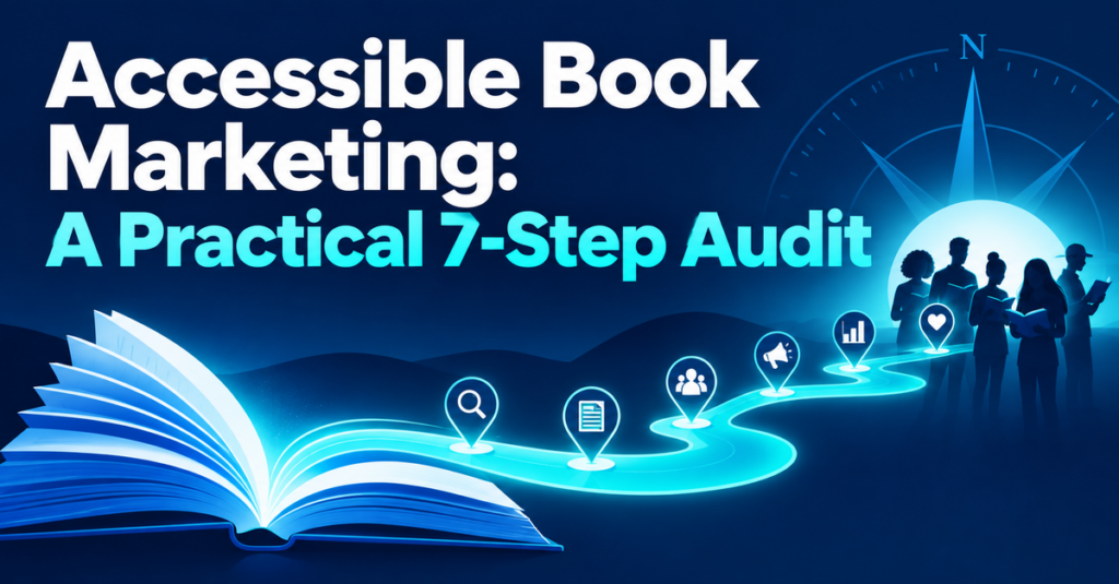

Accessible book marketing is not a specialist campaign aimed at a small group of readers. It is the practical work of making your book easier to notice, understand, buy, borrow, open, and use.
That matters because a reader can be interested in your book and still leave. The cover may be impossible to read at thumbnail size. The sales page may hide the available formats. The ebook may contain unlabelled images. The checkout button may be hard to find by keyboard. A reader who wants larger type or audio may never discover that you offer it.
Issue 8 of The Author’s Weekly Industry Compass highlighted publishing’s growing interest in older readers and the wider “silver economy.” The useful lesson is broader than age. Readers differ in eyesight, hearing, mobility, language, devices, bandwidth, confidence, and available time. If the route to your book demands too much effort, some will understandably choose another route—or another book.
You do not need to rebuild your publishing operation this week. This guide gives you a seven-step reader-path audit you can apply to one title. Each step ends with a small decision you can implement, test, and improve.
Table of Contents
- Define the reader and the route
- Test discovery at real-world size
- Make the sales page easy to understand
- Improve format choice and book accessibility
- Simplify buying, borrowing, and ordering
- Make support and follow-through easy
- Test with people and schedule the next review
- A 90-minute accessible book marketing session
- Reusable reader-path checklist
Why Accessible Book Marketing Helps More Than One Audience
Publishing Perspectives argued on September 3, 2026, that publishing can overlook older readers when it concentrates too narrowly on younger audiences. The article also points toward better accessibility and a more realistic understanding of what varied older readers actually want. Read the Publishing Perspectives analysis.
The phrase “older readers” can tempt us into designing for a stereotype. Resist that. Someone in their seventies may buy audiobooks on a phone every week, while someone in their thirties may require large text, captions, or keyboard navigation. Accessibility is about removing unnecessary barriers, not guessing a person’s abilities from their age.
The Web Content Accessibility Guidelines organize accessibility around content that is perceivable, operable, understandable, and robust. You do not need to memorize the standard to improve an author website, but those four principles provide a useful test: can readers detect the information, use the controls, understand the choices, and access the content with different technologies? Use W3C’s WCAG 2.2 quick reference.
For ebooks, the W3C’s EPUB Accessibility specification addresses both accessible content and the metadata that helps readers discover accessibility features. Amazon KDP likewise provides production guidance covering image descriptions, headings, links, tables, reading order, and other elements. Review EPUB Accessibility 1.2 and Amazon KDP’s ebook accessibility guidance.
This is not only about compliance. It is about reader experience. Clear headings help a screen-reader user, a hurried browser, and a search engine understand a page. Strong contrast helps someone with low vision and someone reading outside in bright light. Plain format labels help a first-time ebook buyer and a librarian ordering for a patron.
Throughout the audit, we will follow two authors:
- Maya independently publishes a mystery series. She controls her website, direct store, ebooks, paperbacks, and some metadata on retail platforms.
- Daniel is traditionally published in nonfiction. His publisher controls the editions and main retailer metadata, while Daniel controls his website, newsletter, speaking resources, and reader communication.
Their control differs, but both can find barriers, fix what they own, and ask better questions about everything else.
Step 1: Define the Reader and the Route
An accessibility audit becomes vague if you begin with “everyone.” Start with one real reader, one book, and one task.
The task might be discovering the book after hearing you on a podcast, checking whether it is available in large print, buying a signed copy, borrowing the audiobook, reading a sample, or downloading a companion worksheet.
Create a reader-path statement
Complete this sentence:
A reader who [has a particular interest, need, or context] should be able to [complete one task] using [device or route] without [the main barrier you suspect].
Maya writes:
A reader who enjoys traditional mysteries and increases the text size on a phone should be able to understand the series order and buy the first ebook without reading tiny graphics or opening several pages.
Daniel writes:
A workshop attendee who uses a keyboard rather than a mouse should be able to find the book, read its description, choose an available format, and download the companion checklist.
Now trace the route in six stages:
- Discovery: Where does the reader first encounter the title?
- Recognition: Can the reader tell what the book is and whether it fits?
- Decision: Can the reader find the description, evidence, price, formats, and terms?
- Transaction: Can the reader buy, borrow, request, or download it?
- Use: Can the reader open, navigate, read, or listen comfortably?
- Follow-through: Can the reader obtain help or find the next useful resource?
Do not audit every channel yet. Select the route most important to this book. For Maya, that is an Instagram post to her mobile landing page and then to the ebook retailer. For Daniel, it is a conference QR code to a resource page and then to a retailer or library request.
Your action: Write one reader-path statement and six-stage route. Mark any stage you cannot currently describe. An unknown route is useful evidence—it shows you where to investigate.
Step 2: Test Discovery at Real-World Size
Marketing assets are often approved on a large monitor, then viewed as a small card in a busy feed. Test the conditions your reader actually encounters.
Check the cover and campaign image
Reduce the cover to approximately the size shown in a retailer search result. Ask:
- Is the title distinguishable?
- Is the author name readable if recognition matters?
- Does the main image remain understandable?
- Is essential information presented only as small text inside the image?
- Does the image retain useful contrast?
W3C guidance generally calls for a contrast ratio of at least 4.5:1 for normal text and 3:1 for large text. Those thresholds are useful when you choose colors for your website and text-based campaign graphics. See W3C’s explanation of minimum text contrast.
Do not place an entire message inside a graphic. Text embedded in an image cannot adapt as easily to a reader’s preferences, and W3C advises using real text instead of images of text when the same presentation can be achieved. Read the W3C guidance on images of text.
Supply a useful text alternative
Alt text should convey the purpose or useful information in an image, not perform SEO theatre. “Book cover” is usually too thin; a long list of keywords is not helpful either.
For Maya’s cover, a useful option is:
Cover of The Clockmaker’s Secret showing a brass clock above a dark village street.
For a linked promotional graphic, the destination may matter more:
Read The Clockmaker’s Secret, the first Rowan Vale mystery.
Amazon’s current ebook guidance says meaningful images require a text alternative, decorative images should not be announced, and alt text should be concise; its guidance sets a maximum of 140 characters. See Amazon KDP’s accessibility guidance.
Maya discovers that the series number appears only in a small banner on the cover. She adds “Book 1 of the Rowan Vale Mysteries” as real text beside the image and includes it in the page metadata.
Daniel’s social graphic contains five lines of event copy. He keeps the short headline in the image but places the date, subject, book title, and link in the post text as well.
Your action: View one campaign asset at phone-feed size. Rewrite its accompanying text so a reader does not need to decipher the image to understand the offer.
Step 3: Make the Sales Page Easy to Understand
A sales page asks the reader to make several decisions quickly. Accessibility suffers when you mix the book description, praise, formats, retailer buttons, event announcements, and newsletter signup without a clear order.
Give the page a predictable hierarchy
A practical sequence is:
- Book title and concise positioning line
- Cover with meaningful alt text
- Short description focused on reader fit
- Available formats and accessibility features
- Price or clear route to current pricing
- Buy, borrow, or request options
- Selected evidence such as reviews or credentials
- Support and contact information
Use true headings rather than making ordinary text large and bold. A meaningful heading structure helps assistive technology expose the page outline and helps every reader scan. W3C’s preliminary accessibility checks recommend reviewing headings as a structural outline rather than a visual effect. Use W3C’s Easy Checks guide.
Link text should make sense out of context. “Buy the paperback,” “Borrow the audiobook,” and “Download the discussion guide” are clearer than three repeated links labelled “Click here.”
Use a five-line book-page test
Ask whether the first useful screen tells the reader:
- What the book is
- Who it is for
- Why it may matter to them
- Which formats are available
- What they can do next
Maya changes this heading:
Welcome to My Books
to:
Rowan Vale Mysteries: Gentle Village Mysteries with Intricate Puzzles
Below it, she adds a one-sentence series promise, the Book 1 cover, and a clearly labelled ebook button. Readers no longer need to open a separate “Shop” menu to understand where to begin.
Daniel changes a resource-page button from “More” to “Read about Clear Decisions at Work.” He adds a separate “Ask your library to order the book” link, because not every interested reader wants or is able to purchase immediately.
Your action: Read only the headings and links on your book page. If they do not tell a coherent story, revise the hierarchy before rewriting the body copy.
Step 4: Improve Format Choice and Book Accessibility
Accessible marketing cannot promise an experience the book itself does not support. Your sales page and metadata should accurately describe the available formats and relevant accessibility features.
Audit the ebook
For a reflowable ebook, check:
- Text can resize without being cut off or overlapping.
- Headings are marked structurally and appear in a sensible order.
- Images that communicate meaning have concise alternatives.
- Decorative images are identified so assistive technology can ignore them.
- Links explain their destination or purpose.
- Tables have a logical reading order and do not depend on color alone.
- The table of contents works.
- Page navigation and reading order are logical.
- Accessibility metadata describes the features truthfully.
The W3C’s EPUB Accessibility 1.2 specification, published August 18, 2026, defines requirements for accessible EPUB publications and for metadata that supports their discovery. Its companion techniques explain practical ways to apply those requirements. Read EPUB Accessibility 1.2 and the EPUB Accessibility Techniques.
Amazon notes that print-replica and image-based fixed-layout Kindle books are not readable through read-aloud or braille features. That does not make every fixed-layout book inappropriate, but it does make the format choice and description important. Review Amazon’s detail-page accessibility information.
Audit print and audio options
For print, consider readable type, line spacing, contrast, paper glare, margins, binding, and whether the design remains usable when the book is held open. A large-print edition is not simply a scaled-up PDF; page size, line length, navigation, and cover communication also need attention.
For audio, make the narrator, duration, edition, and delivery route easy to find. If the book contains diagrams, worksheets, recipes, citations, or exercises, explain whether a companion PDF or accessible web resource is included.
Maya tests her EPUB in more than one reading app and at enlarged text settings. She finds that decorative scene-break images are announced with their filenames. Her formatter marks them decorative and corrects two missing chapter headings.
Daniel asks his publisher which accessibility features are included in the ebook metadata and whether a large-print license is available. On his website, he avoids claiming that every edition is accessible. He states the confirmed features and offers a contact route for format questions.
Your action: Test one format in the way a reader might adapt it. Record what works, what fails, who controls the correction, and what you can describe accurately today.
Step 5: Simplify Buying, Borrowing, and Ordering
A good description cannot rescue a confusing transaction. The reader needs to know where a button leads, what format they are choosing, whether it is available in their location, and what happens next.
Test without a mouse
Open your book page and put the mouse aside. Use the Tab key to move through interactive elements and Shift+Tab to move backward. Check:
- Can you see which element has focus?
- Does the order follow the page logically?
- Can you open menus and activate buttons from the keyboard?
- Can you close pop-ups without becoming trapped?
- Do signup and checkout fields have understandable labels?
- Are error messages specific and easy to find?
WCAG 2.2 includes criteria for keyboard operation and visible focus because readers who cannot use a mouse need both control and orientation. W3C’s Easy Checks provide a practical first review, although they are not a full conformance assessment. Follow W3C’s preliminary evaluation steps.
Offer more than one sensible action
Depending on your publishing route, the page might include:
- Buy directly
- Buy from major or local retailers
- Borrow from a library or subscription service
- Ask a bookseller or librarian to order the book
- Read or listen to a sample
Label each route with its format. Avoid a row of retailer logos with no text, especially if the logos become tiny on mobile.
For bookstore and library requests, supply the title, author, format, ISBN, publisher or imprint, distributor, publication date, price, and territory availability. Accurate ordering information is an accessibility improvement because it reduces the effort required from the reader and the intermediary.
Maya replaces six logo-only links with three text-labelled choices: “Buy the ebook,” “Order the paperback,” and “Ask your library.” A secondary link opens the complete retailer list.
Daniel cannot change a retailer’s checkout, but he can make the handoff clear. His page tells readers that the next link opens the publisher’s retailer selector. He also adds ISBNs so a reader can request the correct edition locally.
Your action: Complete the main transaction on a phone and by keyboard. Fix one point where the reader must guess the destination, edition, price, or next step.
Step 6: Make Support and Follow-Through Easy
Accessibility problems do not always appear during a planned test. A reader may receive a broken download, encounter an unreadable worksheet, or need to confirm whether an edition works with a particular device.
Create a small support promise
Tell readers:
- How to contact you or the responsible retailer
- What information to include
- When they can reasonably expect a response
- Which problems you can resolve
- Where platform-specific support belongs
Use plain language. A useful contact prompt is:
If you have trouble accessing a file or using this page, email [address] with the book title, format, device or app, and a short description of the problem. I will reply within [time] or direct you to the partner responsible for the purchase.
Do not ask readers to disclose more personal information than you need. Never request passwords. If the problem belongs to a retailer, explain how to find the order reference without asking the reader to send payment details.
Make the next step equally clear
Follow-through includes series order, companion materials, corrections, reading-group guides, transcripts, and related books. A reader should not need to decode a clever navigation label to continue.
Maya adds a “Start or continue the series” section containing numbered titles in text, not only cover images. Her delivery email includes a plain-text support link and instructions for loading the ebook.
Daniel adds a transcript below an embedded interview and provides the workshop worksheet as a tagged document rather than an image-only PDF. He labels the resource with the book title and edition so readers know it matches their copy.
Your action: Ask someone unfamiliar with your site to find help and the next relevant resource. If they hesitate, revise the labels or placement before adding more content.
Step 7: Test with People and Schedule the Next Review
Automated tools can identify missing alt attributes, contrast problems, duplicate labels, and some structural errors. They cannot reliably tell you whether the description is clear, the route feels trustworthy, or the format information answers a reader’s real question.
Use three layers of testing
- Your own quick review: phone, zoom, keyboard, headings, links, and one read-aloud or screen-reader pass.
- Automated checks: use a reputable accessibility checker for useful clues, then review each result rather than treating the score as proof.
- Human task testing: ask several people with different devices, experiences, or access needs to complete a specific task and describe where they pause.
W3C maintains a list of evaluation tools and emphasizes that tools differ in the standards, languages, formats, and assistance they support. Selection matters, and automated checking remains only part of evaluation. Explore W3C’s accessibility evaluation tools.
Give testers a task, not a tour:
You heard about this book in an interview. Starting on this page, find the first book in the series, confirm whether you can enlarge the ebook text, and identify a way to borrow or buy it. Please say what you expect each link to do.
Observe without rescuing them too quickly. Record the first barrier, the consequence, and the smallest credible fix.
Maya’s tester does not notice the library option below the retailer carousel. Maya moves it beside the purchase choices and gives it a descriptive heading.
Daniel’s tester finds the correct book but cannot tell whether the downloadable workbook is accessible. Daniel adds the file type, page count, and a contact option for an alternative format.
Schedule another short audit after a redesign, platform change, new edition, or major campaign. Otherwise, review important routes quarterly. Links break, formats change, and new content can weaken a once-clear page.
Your action: Arrange one five-minute task test. Fix the first meaningful barrier before collecting a long wish list.
A 90-Minute Accessible Book Marketing Session
If the full audit feels substantial, improve one title in a focused session.
Minutes 0–10: Choose the route
- Select one book and one reader task.
- Write the reader-path statement from Step 1.
- Open the website, retailer page, book files, and ordering information.
Minutes 10–25: Check discovery
- View the cover and one campaign image at feed size.
- Check contrast and essential text.
- Add or improve meaningful alt text.
Minutes 25–45: Repair the sales page
- Read only the headings and links.
- Put the book promise, formats, and main action in a logical order.
- Replace vague link labels.
Minutes 45–60: Test one format
- Enlarge ebook text or inspect the print edition at normal reading distance.
- Check navigation, images, links, and companion material.
- Record one correction for you or your publishing partner.
Minutes 60–75: Test the transaction
- Use the main path on a phone.
- Navigate the page by keyboard.
- Confirm edition labels, ISBNs, price routes, and library or ordering options.
Minutes 75–85: Check support
- Find the contact route and test it.
- Add a short access-help prompt.
- Clarify the next book or resource.
Minutes 85–90: Finish the loop
- Choose no more than three fixes.
- Assign an owner and date to each.
- Schedule a human task test and the next review.
At the end of 90 minutes, you will not have certified an entire publishing system. You will have made one important reader route clearer and created evidence for the next improvement.
Reusable Reader-Path Scorecard
Score each area from 0 to 2:
- 0 — Missing, unknown, or blocked
- 1 — Partly usable but needs clarification or repair
- 2 — Clear, tested, and accurately described
| Area | Review question | Score 0–2 | Next action |
|---|---|---|---|
| Discovery | Can a reader recognize the book and message at real-world size? | [ ] | [ ] |
| Alternatives | Do meaningful images and media have useful text alternatives? | [ ] | [ ] |
| Understanding | Do headings, descriptions, links, and choices make sense quickly? | [ ] | [ ] |
| Formats | Are available formats and confirmed accessibility features clear? | [ ] | [ ] |
| Transaction | Can a reader buy, borrow, request, or download without guessing? | [ ] | [ ] |
| Operation | Can the important website route be used by phone and keyboard? | [ ] | [ ] |
| Support | Can a reader report a barrier and find the next useful step? | [ ] | [ ] |
The maximum score is 14, but the pattern matters more than the total. A zero that prevents purchase or reading deserves attention before a cosmetic improvement elsewhere.
Reusable Accessible Book Marketing Checklist
Discovery and campaign assets
Sales page
Book and formats
Buying, borrowing, and support
Testing and review
Conclusion: Remove One Barrier at a Time
Accessible book marketing begins with a generous assumption: readers should not have to overcome avoidable obstacles to understand or use a book that may matter to them.
You may control every part of the route, or only your own website and communication. Either way, you can make the information clearer, test the tools you own, describe formats accurately, and ask publishers, designers, formatters, retailers, and distributors better questions.
Begin with one reader, one book, and one task. Follow the path from discovery to use. When you find friction, do not turn it into an overwhelming renovation. Remove the barrier with the greatest consequence, test again, and keep a short record of what changed.
That work can help readers with disabilities, older readers, mobile readers, people using unfamiliar technology, readers in difficult conditions, and anyone who simply appreciates clarity. It also makes your publishing more understandable to you.
The aim is not a perfect score. It is a book path that welcomes more of the people you hoped to reach.
For more practical publishing guidance each week, read or subscribe to The Author’s Weekly Industry Compass at publishing.lbdlibrary.com.